← 开源
reiinakano

scikit-plot

An intuitive library to add plotting functionality to scikit-learn objects.

Model DevelopmentClassical MLPython
在 GitHub 打开
增长势头
+024 小时新增 Star0.0%
2.44k
Star
284
Fork
+2
本周
11
贡献者
创建于 2017-02-04 · 更新于 2026-10-13 · 今日第 8615 名
主要开发者
reiinakanoExcaliburZerocr458

reiinakano/scikit-plot 排名第 8,615,有 2,435 个星标。

同类别比较

reiinakano/scikit-plot 排名第 8,615,此处有 8 个同类条目;wolny/pytorch-3dunet 排名第 8,621。

同类别比较
名称排名指标
HybridRobotics/whole_body_tracking8,603
语言:
Python
星标数:
2,446
分叉数:
334
github/CodeSearchNet8,604
语言:
Jupyter Notebook
星标数:
2,445
分叉数:
408
简介:
Datasets, tools, and benchmarks for representation learning of code.
HobbitLong/RepDistiller8,605
语言:
Python
星标数:
2,444
分叉数:
398
简介:
[ICLR 2020] Contrastive Representation Distillation (CRD), and benchmark of recent knowledge distillation methods
hitsz-ids/synthetic-data-generator8,608
语言:
Python
星标数:
2,440
分叉数:
396
简介:
SDG is a specialized framework designed to generate high-quality structured tabular data.
wolny/pytorch-3dunet8,621
语言:
Jupyter Notebook
星标数:
2,425
分叉数:
559
简介:
3D U-Net model for volumetric semantic segmentation written in pytorch
CyberZHG/keras-bert8,626
语言:
Python
星标数:
2,420
分叉数:
497
简介:
Implementation of BERT that could load official pre-trained models for feature extraction and prediction
HuCaoFighting/Swin-Unet8,627
语言:
Python
星标数:
2,420
分叉数:
363
简介:
[ECCVW 2022] The codes for the work "Swin-Unet: Unet-like Pure Transformer for Medical Image Segmentation"
rbgirshick/rcnn8,632
语言:
Matlab
星标数:
2,416
分叉数:
969
简介:
R-CNN: Regions with Convolutional Neural Network Features
关键参数与规格
关键参数与规格
参数值
语言Python
类别Model Development
子类别Classical ML
关键词Visualization
星标数2,435
分叉数284
贡献者11
创建日期2017-02-04
更新日期2026-10-13
1 天星标数0
7 天星标数2
排名8,615
上次排名8,686
排名变化71
7 天星标排名7,787
上次 7 天星标排名7,806
7 天星标排名变化19
总星标排名5,391
上次总星标排名5,383
总星标排名变化-8
国家USA
README 摘录

Welcome to Scikit-plot Single line functions for detailed visualizations The quickest and easiest way to go from analysis. Scikit-plot is the result of an unartistic data scientist's dreadful realization that *visualization is one of the most crucial components in the data science process, not just a mere afterthought*. Gaining insights is simply a lot easier when you're looking at a colored heatmap of a confusion matrix complete with class labels rather than a single-line dump of numbers

enclosed in brackets. Besides, if you ever need to present your results to someone (virtually any time anybody hires you to do data science), you show them visualizations, not a bunch of numbers in Excel. That said, there are a number of visualizations that frequently pop up in machine learning. Scikit-plot is a humble attempt to provide aesthetically-challenged programmers (such as myself) the opportunity to generate quick and beautiful graphs and plots with as little boilerplate as possible

. Say we use Naive Bayes in multi-class classification and decide we want to visualize the results of a common classification metric, the Area under the Receiver Operating Characteristic curve. Since the ROC is only valid in binary classification, we want to show the respective ROC of each class if it were the positive class. As an added bonus, let's show the micro-averaged and macro-averaged curve in the plot as well. Let's use scikit-plot with the sample

digits dataset from scikit-learn. Encaptured in that small example is the entire philosophy of Scikit-plot: **single line functions for detailed visualization**. You simply browse the plots available in the documentation, and call the function with the necessary arguments. Scikit-plot tries to stay out of your way as much as possible. And when you *do* need the bells and whistles, each function offers a myriad of parameters for customizing various elements in your plots. Finally, compare and view

the non-scikit-plot way of plotting the multi-class ROC curve. Compatibility with non-scikit-learn objects. Although Scikit-plot is loosely based around the scikit-learn interface, you don't actually need Scikit-learn objects to use the available functions. As long as you provide the functions what they're asking for, they'll happily draw the plots for you. Here's a quick example to generate the precision-recall curves of a Keras classifier on a sample dataset. You can see

clearly here that needs only the ground truth y-values and the predicted probabilities to generate the plot. This lets you use *anything* you want as the classifier, from Keras NNs to NLTK Naive Bayes to that groundbreaking classifier algorithm you just wrote. First, make sure you have the dependencies Scikit-learn and Matplotlib installed. Then just run: Or if you want the latest development version, clone this repo and run at the root folder. If using conda, you can

install Scikit-plot by running: Documentation and Examples Explore the full features of Scikit-plot. You can find detailed documentation

常见问题

记录了多少星标和分叉?

reiinakano/scikit-plot 有 2,435 个星标和 284 个分叉。

仓库排名是多少?

reiinakano/scikit-plot 排名第 8,615。

记录的语言和类别是什么?

reiinakano/scikit-plot 有 2,435 个星标,语言为 Python,类别为 Model Development。

哪个仓库排名最接近?

reiinakano/scikit-plot 与 wolny/pytorch-3dunet 比较,后者排名第 8,621,有 2,425 个星标。

README

Welcome to Scikit-plot

Single line functions for detailed visualizations

The quickest and easiest way to go from analysis...
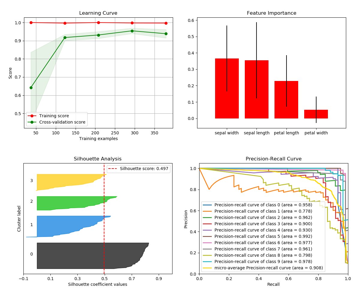
...to this.

Scikit-plot is the result of an unartistic data scientist's dreadful realization that visualization is one of the most crucial components in the data science process, not just a mere afterthought.

Gaining insights is simply a lot easier when you're looking at a colored heatmap of a confusion matrix complete with class labels rather than a single-line dump of numbers enclosed in brackets. Besides, if you ever need to present your results to someone (virtually any time anybody hires you to do data science), you show them visualizations, not a bunch of numbers in Excel.

That said, there are a number of visualizations that frequently pop up in machine learning. Scikit-plot is a humble attempt to provide aesthetically-challenged programmers (such as myself) the opportunity to generate quick and beautiful graphs and plots with as little boilerplate as possible.

Okay then, prove it. Show us an example.

Say we use Naive Bayes in multi-class classification and decide we want to visualize the results of a common classification metric, the Area under the Receiver Operating Characteristic curve. Since the ROC is only valid in binary classification, we want to show the respective ROC of each class if it were the positive class. As an added bonus, let's show the micro-averaged and macro-averaged curve in the plot as well.

Let's use scikit-plot with the sample digits dataset from scikit-learn.

# The usual train-test split mumbo-jumbo
from sklearn.datasets import load_digits
from sklearn.model_selection import train_test_split
from sklearn.naive_bayes import GaussianNB

X, y = load_digits(return_X_y=True)
X_train, X_test, y_train, y_test = train_test_split(X, y, test_size=0.33)
nb = GaussianNB()
nb.fit(X_train, y_train)
predicted_probas = nb.predict_proba(X_test)

# The magic happens here
import matplotlib.pyplot as plt
import scikitplot as skplt
skplt.metrics.plot_roc(y_test, predicted_probas)
plt.show()
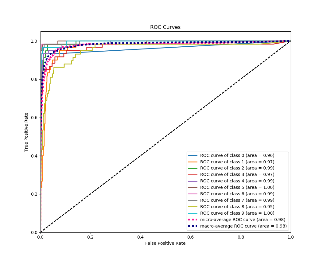
Pretty.

And... That's it. Encaptured in that small example is the entire philosophy of Scikit-plot: single line functions for detailed visualization. You simply browse the plots available in the documentation, and call the function with the necessary arguments. Scikit-plot tries to stay out of your way as much as possible. No unnecessary bells and whistles. And when you do need the bells and whistles, each function offers a myriad of parameters for customizing various elements in your plots.

Finally, compare and view the non-scikit-plot way of plotting the multi-class ROC curve. Which one would you rather do?

Maximum flexibility. Compatibility with non-scikit-learn objects.

Although Scikit-plot is loosely based around the scikit-learn interface, you don't actually need Scikit-learn objects to use the available functions. As long as you provide the functions what they're asking for, they'll happily draw the plots for you.

Here's a quick example to generate the precision-recall curves of a Keras classifier on a sample dataset.

# Import what's needed for the Functions API
import matplotlib.pyplot as plt
import scikitplot as skplt

# This is a Keras classifier. We'll generate probabilities on the test set.
keras_clf.fit(X_train, y_train, batch_size=64, nb_epoch=10, verbose=2)
probas = keras_clf.predict_proba(X_test, batch_size=64)

# Now plot.
skplt.metrics.plot_precision_recall_curve(y_test, probas)
plt.show()
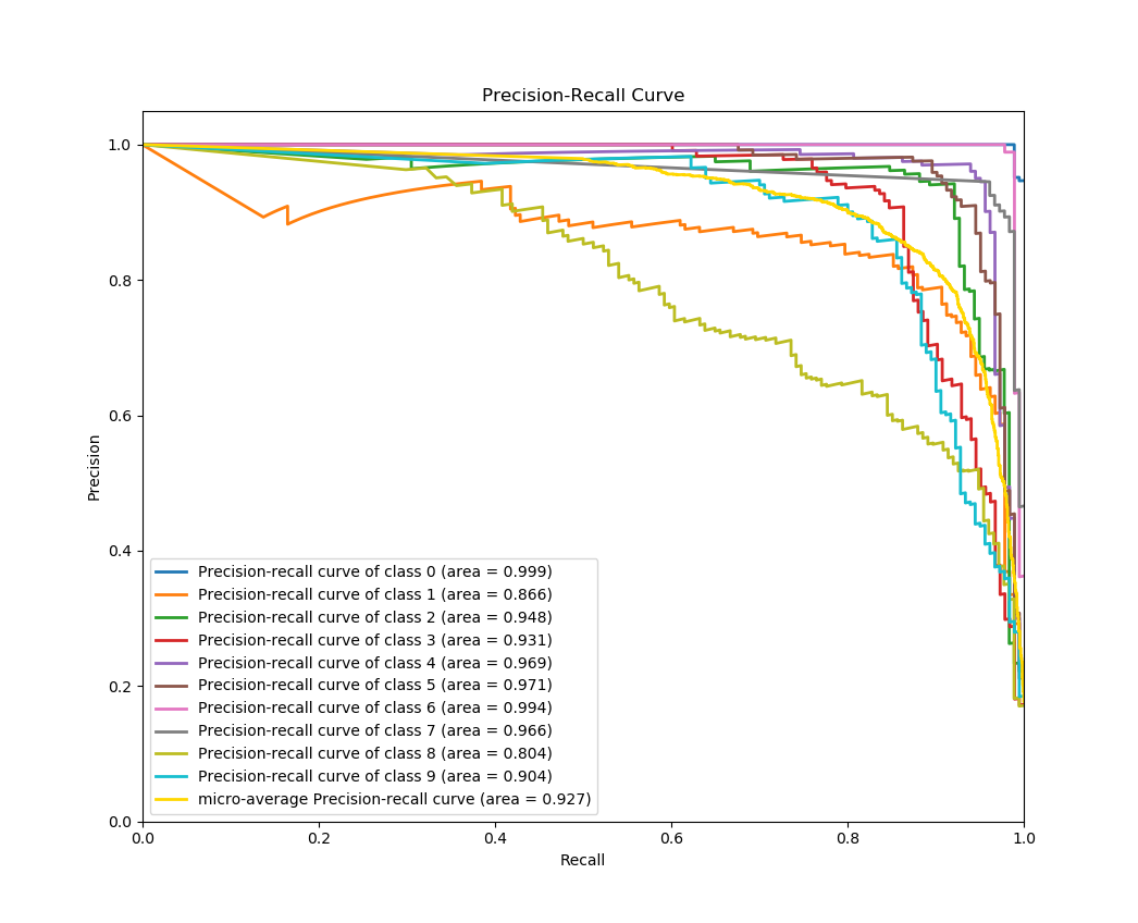
You can see clearly here that skplt.metrics.plot_precision_recall_curve needs only the ground truth y-values and the predicted probabilities to generate the plot. This lets you use anything you want as the classifier, from Keras NNs to NLTK Naive Bayes to that groundbreaking classifier algorithm you just wrote.

The possibilities are endless.

Installation

Installation is simple! First, make sure you have the dependencies Scikit-learn and Matplotlib installed.

Then just run:

pip install scikit-plot

Or if you want the latest development version, clone this repo and run

python setup.py install

at the root folder.

If using conda, you can install Scikit-plot by running:

conda install -c conda-forge scikit-plot

Documentation and Examples

Explore the full features of Scikit-plot.

You can find detailed documentation here.

Examples are found in the examples folder of this repo.

Contributing to Scikit-plot

Reporting a bug? Suggesting a feature? Want to add your own plot to the library? Visit our contributor guidelines.

Citing Scikit-plot

Are you using Scikit-plot in an academic paper? You should be! Reviewers love eye candy.

If so, please consider citing Scikit-plot with DOI

APA

Reiichiro Nakano. (2018). reiinakano/scikit-plot: 0.3.7 [Data set]. Zenodo. http://doi.org/10.5281/zenodo.293191

IEEE

[1]Reiichiro Nakano, “reiinakano/scikit-plot: 0.3.7”. Zenodo, 19-Feb-2017.

ACM

[1]Reiichiro Nakano 2018. reiinakano/scikit-plot: 0.3.7. Zenodo.

Happy plotting!

排名相邻
同类项目