Extend UI
Extend UI is a set of open-source components for document agents, user-facing document flows, and internal tools.
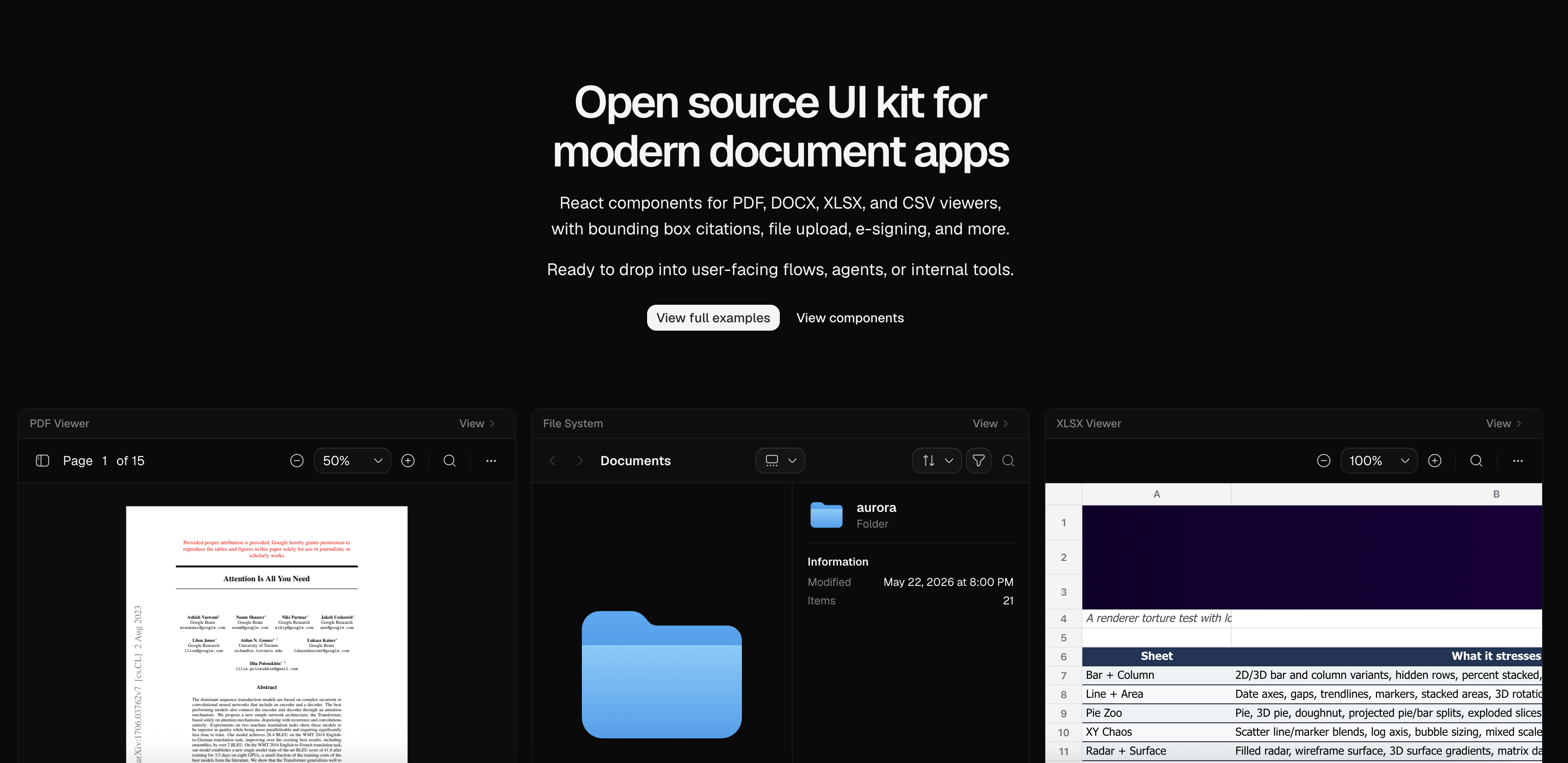
The library includes 14 components and examples for PDF, DOCX, and XLSX viewers, plus bounding box citations, file upload, file thumbnails, e-signature, document splitting, layout blocks, and Finder-style file browsing. Components are fully customizable, MIT licensed, and available through the shadcn component registry.
Extend UI started as the internal component layer for Extend. We built it after evaluating existing file viewer and document component libraries and needing more complete, polished building blocks for document-heavy products. The components are maintained in production at Extend and are used across workflows that process millions of pages, so fixes and improvements continue to flow back into the project.
Use Extend UI when you need document viewers, review surfaces, file-management interfaces, or agent-facing document tools without starting from a generic viewer library. Because each component is installed as source, it also works well with design-system agents and prototyping tools that need editable React and Tailwind code.
Links
- Documentation: https://www.extend.ai/ui
- GitHub: extend-hq/ui
- Registry namespace:
@extend/*
Getting Started
Configure the style-aware registry in your components.json:
{
  "registries": {
    "@extend": "https://www.extend.ai/ui/r/styles/{style}/{name}.json"
  }
}
Then install a component with the shadcn CLI:
npx shadcn@latest add @extend/pdf-viewer
Then render the installed component from your app:
import { PDFViewer } from "@/components/extend/pdf-viewer"

export default function Page() {
  return
}
The react-pdf version of the PDF viewer is available at
pdf-viewer.tsx.
Extend UI components are copied into your project as source, so you can adapt
them to your app. Shared primitives such as Button, Select, Dialog,
and Tooltip are imported directly from your existing UI components. The
registry selects Base or Radix source using your configured style and transforms
icons for your selected icon library. Keep existing primitives when the CLI
asks about overwriting them. If your project uses a different alias or design-system path, update the
generated imports to match, for example changing
@/components/ui/button or @/components/ui/select to your local primitive
paths. You can also set those aliases in components.json before installing so
new components are generated closer to your app structure.
Use current shadcn primitive APIs. The historical default style is
deprecated upstream and must
be migrated before installing.
Examples
Layout Blocks
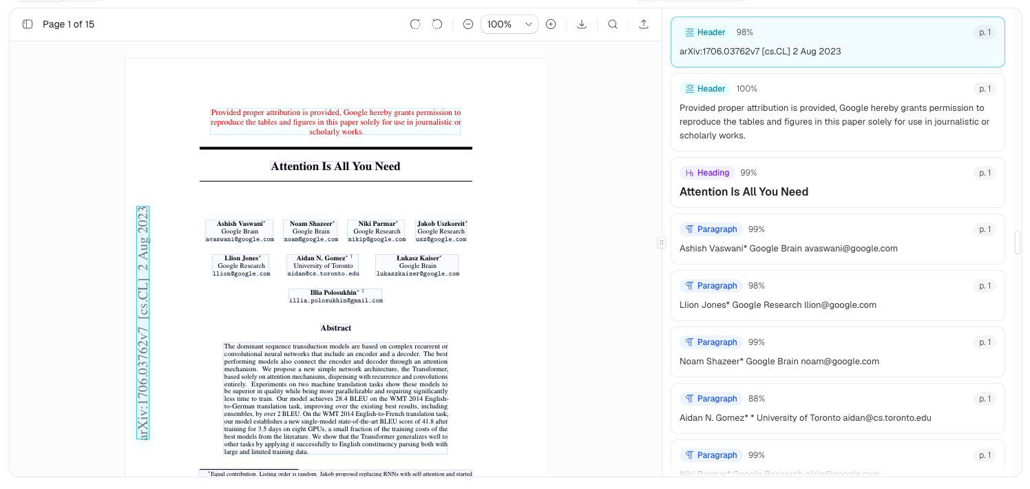
Inspect OCR and layout output with selectable blocks, confidence, markdown text, and PDF overlays that stay connected to the rendered page.
npx shadcn@latest add @extend/layout-blocks-block
import type { ParsedOcrOutput } from "@/components/extend/layout-blocks"
import { OcrBlocksBlock } from "@/components/blocks/layout-blocks-block"

const output: ParsedOcrOutput = {
  chunks: [
    {
      blocks: [
        {
          id: "title",
          type: "heading",
          content: "Statement of Work",
          metadata: {
            page: { number: 1, width: 612, height: 792 },
            avgOcrConfidence: 0.99,
          },
          boundingBox: { left: 72, top: 96, right: 360, bottom: 124 },
        },
      ],
    },
  ],
}

export default function Page() {
  return
}
Bounding Box Citations
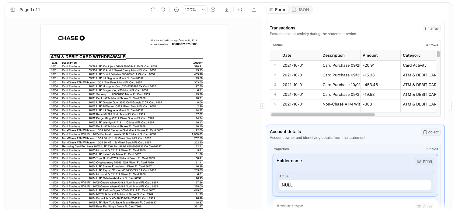
Review extracted values against the source PDF with field-level citations, editable form controls, JSON diffing, and page overlays.
npx shadcn@latest add @extend/bounding-box-citations-block
import type { ReviewField } from "@/components/extend/bounding-box-citations"
import { HumanReviewBlock } from "@/components/blocks/bounding-box-citations-block"

const fields: ReviewField[] = [
  {
    key: "invoice_total",
    schema: {
      type: "number",
      title: "Invoice total",
      description: "Total amount due on the invoice.",
    },
    actual: 1280.5,
    expected: 1280.5,
    location: {
      page: 1,
      area: { left: 62, top: 82, width: 22, height: 4 },
    },
  },
]

export default function Page() {
  return (

  )
}
File System
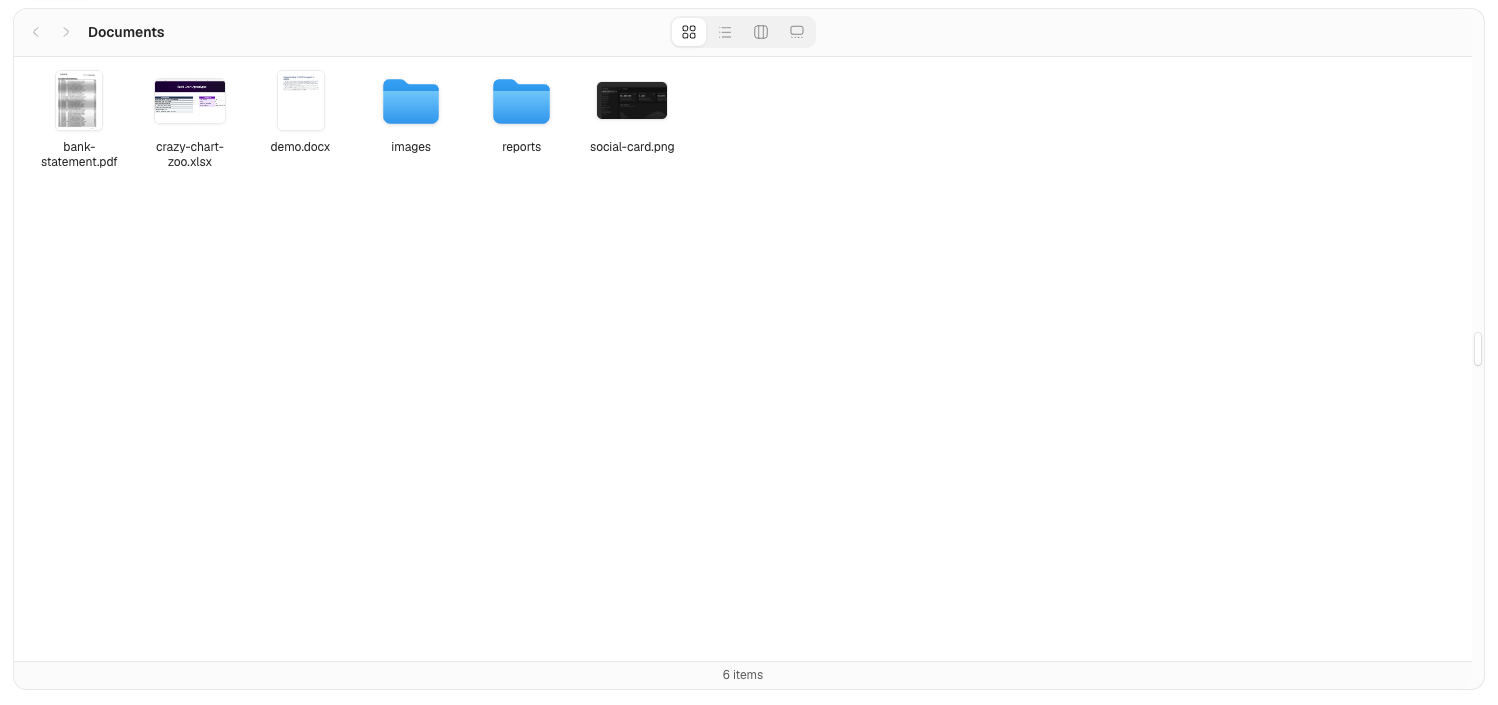
A Finder-style file browser for object-store manifests. It supports icon, list, column, and gallery views, and opens PDF, DOCX, XLSX, and image files in viewer dialogs.
npx shadcn@latest add @extend/file-system-block
import type { FileSystemItem } from "@/components/extend/file-system"
import { FileSystemBlock } from "@/components/blocks/file-system-block"

const items: FileSystemItem[] = [
  {
    kind: "folder",
    path: "reports/",
    hasChildren: true,
  },
  {
    kind: "file",
    path: "bank-statement.pdf",
    contentType: "application/pdf",
    url: "/documents/bank-statement.pdf",
    previewImageUrl: "/documents/bank-statement-preview.png",
  },
]

export default function Page() {
  return (

        `/api/files/sign?path=${encodeURIComponent(file.path)}`
      }
      loadChildren={async ({ path }) => {
        const response = await fetch(
          `/api/files?prefix=${encodeURIComponent(path)}`
        )
        return response.json()
      }}
    />
  )
}
Popular Components
npx shadcn@latest add @extend/pdf-viewer
npx shadcn@latest add @extend/docx-viewer
npx shadcn@latest add @extend/xlsx-viewer
npx shadcn@latest add @extend/file-upload
npx shadcn@latest add @extend/file-thumbnail
npx shadcn@latest add @extend/e-signature
Development
pnpm install
pnpm v4:dev
The site runs at http://localhost:4000.
Created By
Extend UI is built and maintained by Extend for teams building modern document processing products.
License
Licensed under the MIT license.